By the early 1900s, household electricity and running water started to become a norm in the Western world. Industrialization brought the evolution of kitchen design to a new era.
Factories mass-produced fixtures, ever-more modern appliances, cabinetry, lighting, and storage units, and gas stoves were introduced.
But it wasn’t until the 1930s that the kitchen began to take on its modern shape. The kitchen configuration that we all know now, has its roots, like a lot of modern design, in the German school known as the Bauhaus.
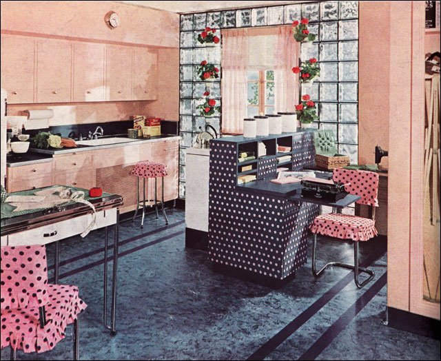
1940 Armstrong Polka Dot Kitchen – Glass block appeared during the 1930s and combined with the clean streamlined design of the late Deco period, this kitchen achieves a bit of modernity.
For Bauhaus designers, beauty was not something to be added to a functional item in the form of extra frills; instead, it was achieved through careful choices of materials, proportions, textures, and colors for the functional features of the objects.
Wall-mounted cabinets are built in over a continuous countertop resting on more built-in cabinets between the sink and the cooker.
The faces of the cabinets are flush and smooth, apart from simple projecting knobs; there are no moldings, panels, or decorative elements that would collect dirt. The floors throughout are rubber, a linoleum substitute, so that all surfaces are easy to clean with a quick wipe.
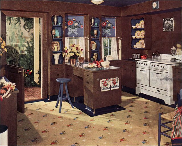
1940 Armstrong Kitchen in Brown and Blue – Most kitchen designs were lighter and brighter than this dark chocolate brown kitchen. Blue accents and white appliances provide some relief in this “gardener’s kitchen” as it was referred to in the ad which ran in American Home.
An Austrian architect, Margarete Shutte-Lihotzy, revolutionized the Frankfurt Kitchen, a prototype for the modern kitchen, and introduced the “golden triangle” of cooker, fridge, and sink placed for maximum efficiency.
These features are commonplace today, but in the 1920s dedicated kitchens were rare outside upper-class households. Most poor and middle-class people had none of the modern appliances seen here.

1940 Nairn Linoleum Ad – Very Pink Kitchen – This Nairn ad ran in the American Home magazine and it’s really pink. The combination of pink and navy blue isn’t uncommon but the amount of pink is. Even the ceiling is a lighter shade. It really makes those white appliances and red accessories pop.
They cooked on a stove in the living room, and used separate furniture for food storage and preparation, rather than an integrated design of built-in cupboards and countertops.
Kitchens of the 1940s were defined by their emphasis on sleekness, in part a reflection of the changing times, and in part out of necessity as World War II raged in the background.

1941 Nairn Linoleum Kitchen – Shown in an American Home magazine, this classic red, light tan, and green scheme has lots of clean modern elements. As an ad for Nairn, one of the oldest flooring companies in the US, the linoleum was the featured element, but the tan walls and red linoleum counters make a nice counter point to the green-topped Aalto stools. Also seen regularly were the window walls under the cabinets.
Technology made huge leaps in kitchen gadgets like electric ranges and refrigerators, which were finally becoming commonplace.
Aesthetically, kitchens remained plain and simple, but people also began treating more utilitarian items as decor, such as having decorative storage containers or leaving bright colored small appliances out on the counter.
Bold colors were in vogue, particularly red and blue to bring a patriotic tone to the kitchen.

1942 Armstrong Family Kitchen – Armstrong ran full color ads throughout the Depression and WWII advertising their various flooring, wall, and insulation products. Unlike many companies they had a dedicated staff responsible for coming up with new room ideas constantly. Though “high designers” like Raymond Lowey and Russell Wright influenced the direction of interior design, it was companies like Armstrong that appealed most directly to the primary decision maker … the American housewife.
On the one hand, kitchens were still fairly small. Linoleum was still widely used as a floor covering. Colors often hovered in the range of pastels. Iconographic shapes like scallops, sweeps, and curves were common.
By the 1950s, kitchens began to resemble modern kitchens. Kitchens started to become not only more functional, but more stylish as well. Although particle board had been invented, steel cabinets were more common.

1942 Armstrong Pennsylvania Dutch – The folkloric style is one that surfaces here and there consistently throughout the 20th century. Painted Pennsylvania Dutch flowers and birds, an Early American theme, and antiques (or wannabes) create a traditional, comfortable look that appealed to many homeowners.
They were factory-made and arguably marked the beginning of standardized kitchen design. Just as we can choose from a variety of standard cabinets today, homeowners could choose the steel cabinets they wanted from a variety of sizes and designs.
The 1950s saw the beginnings of the designer kitchen. Ergonomics became more important and the “kitchen triangle” became the standard kitchen design.

1945 Armstrong with Working Pantry – This kitchen is dark with the black and green prominently featured in the scheme. The white of the pantry and light floor serve to minimize the light absorbing qualities, but it’s the functionality of the pantry that steals the show. It’s fully functional for baking and other food prep chores. When not in use the doors close and the kitchen becomes neat and tidy.
Pastel colors were popular in the era and linoleum floors were almost a requirement. Linoleum was a fairly new product then and homeowners liked having a seamless flooring material that was soft underfoot.
Linoleum floors came in a range of styles and colors, giving homeowners the opportunity of creating a stylish kitchen.

1945 American Gas Association Kitchen – This kitchen ad appeared in Ladies Home Journal in mid 1945. It may have been the first of the New Freedom Gas Kitchen ads published. This one is notable for its blue, white, and yellow color scheme and no name … the rest of the kitchen designs had names.
The 1950s also saw the beginning of the use of high-pressure laminates as kitchen benchtops.
Because it was a new and revolutionary product, laminate benchtops were in demand even in high-end kitchens. When high-pressure laminates were not used, benchtops were often tiled.

1945 Picture Window Kitchen – Immediately after the war, the American Gas Association launched its New Freedom Gas Kitchen campaign. This image appeared in Ladies Home Journal as the “Picture Window Kitchen.” Most kitchens were named to reflect their primary characteristic. This apple green and melon-colored kitchen was bright and cheery.
Yet kitchens were still closed off rooms. The open plan kitchen, a concept by architect Frank Lloyd Wright, was still rare in the 1950s, but many mark the ‘50s as the decade that paved the way for their rise to popularity.
Phil Kean says that, “Contemporary kitchens, as well as much of the open and airy contemporary home designs of today, certainly must pay homage to the great influences of Frank Lloyd Wright and the advent of mid-century modern architecture.”

1945 Tiny Armstrong Kitchen – This kitchen is a tiny 6’x6’. The open door is designed to function as a step to access upper cupboards. After WWII, many people were still living in cramped quarters so small, attractive kitchen designs would have appealed to many people including apartment dwellers.

1945 Congoleum Linoleum Rug – This 1945 Congoleum ad was published in Ladies Home Journal and reflects the continuation of 1930s style. Unlike its main competitor, Armstrong, the Congoleum company was more erratic in its advertising style. This kitchen would be pretty easy to replicate today though with contemporary linoleum on the floors and counters right down to the gooseneck faucet on the sink. Red, green and white is a timeless color scheme.

1946 Crane Kitchen – This ad was published in American Home magazine. The color scheme of white, yellow, and green is very calm and the lack of clutter is very attractive. Unlike many Early American interiors, there no busyness — the simplicity here is unusual.

1946 AGA Kitchen Laundry Combination – This ad was published in Ladies Home Journal and featured one of the American Gas Association’s New Freedom kitchens. The color scheme of red, green, and yellow (or gold) has always been a popular combination. The counters and floor were probably both linoleum though in a few short years, plastics like Formica would begin to dominate the market.

1947 AGA Americana Kitchen – The Americana kitchen was published in American Home magazine among others and reflected the optimistic patriotism of the winners of the Second World War. The glass block between the stove and breakfast booth is a nice mid-century touch.

1947 AGA Mixing Corner Kitchen – This ad for a “Mixing Corner Kitchen” was published in American Home magazine. Red, green, yellow, and crisp white steel cabinetry was a classic color combo. The steel cabinetry was big during the post-War years as companies retooled to meet the needs for kitchen cabinets instead of machine gun turrets.

1947 AGA “Old House, New Kitchen” – Intended to appeal to owners of older homes who may have wanted a kitchen update for their mid-1920s house, this ad by the American Gas Association was published in American Home. During the post-War years, they published a series of attractive color illustrations reflecting the current trends in kitchen design.

1947 AGA Shipshape Kitchen – A variant on the popular red, white, and blue theme replaced the red with a maroon. This kitchen design shows all the amenities desired by the American homemaker after WWII including the stand mixer, built-in dishwasher, and a brand new gas range. We like the small breakfast booth.

1947 American Standard Kitchen – This small brochure, published by American Standard, shows colors that were muted and toned down. The combinations ranged from odd (to our eye) to very sophisticated. This color scheme comes from the palette of colors in the brochure: Ivoire de Medici, Corallin, Clair de Lune Blue, and T’ang Red.

1948 Armstrong Kitchen With Pantry – Keeping a small kitchen tidy, but functional, is as much a challenge today as it was in 1948 when this ad appeared in American Home magazine. In keeping with the post-War period, it is yet another example of the popular red, white, and blue color scheme that captivated many American homeowners.

1948 Armstrong Kitchen – This ad for a very busy, multifunction kitchen appeared in American Home in 1948. Regardless of how you feel about the color scheme or layout, this kitchen packs a lot of function into a small footprint.

1948 Armstrong Kitchen Ideas – If you like kitchens with scallops, this is the one for you. Here’s an interesting design, again in red, white, and blue, with lots of over the top scallops in the floor and trim. A lazy-susan corner cabinet shows how easy it is to design functional storage in a small footprint.

1948 Armstrong Kitchen With Working Pantry – Right after WWII, the lead designer at Armstrong seems to have been quite taken with the idea of a working pantry that could be closed off when not in use. This one features an accordion-style door on a track, which was quite a space saver. Everything is tidy and organized — a feature that wouldn’t have been lost on many homemakers.

1948 Modern Armstrong – This modern style kitchen shows Armstrong linoleum off to good advantage. The cabinets have tambour doors, a post War design feature that appears in many publications of the period. Eat in kitchens were also desirable and many had both a booth or nook and a counter breakfast bar.

1949 Crane Kitchen – During the 1920s Crane advertised broadly and in color. During the Depression and through WWII, their ads were primarily in black and white. All that changed after the War when they began advertising using both color illustrations and photos.

1949 Youngstown Kitchen – Advertising during the 1940s and ’50s was often cute and followed a theme. This image is from a Youngstown ad that touted the wonderousness of their steel cabinets. Each ad has some kind of happy family image that has since come to embody our understanding of the period. The kitchens depicted were modern, clean, and affordable … all good reasons to buy them. Finding steel cabinets now has become somewhat challenging, but they work up really well in retro kitchen renovations. Some people sand them down and have them refinished by auto painters.

1949 Armstrong Kitchen – Shown in Ladies Home Journal, this Armstrong ad has the creative storage ideas as well as their latest linoleum pattern to entice home owners considering an update to their kitchen. Some of the ideas like the shallow wall storage and drop-leaf work space would maximize the functionality of many of today’s kitchens.

1949 Bird Linoleum Kitchen – This ad for Bird linoleum is interesting both for its design, which is more typical of the pre-WWII period than the late 1940s and its relative rarity. Though Bird had been in business for decades it was never as large as the main flooring companies and advertisements like this one are unusual.

1949 Pabco Linoleum Ad – This ad for Pabco linoleum appeared in Ladies Home Journal and is included here because it’s color scheme foreshadows some of the color schemes that would come to be enormously popular during the 1950s … in this case, turquoise, orange, and brown.

1949 Ladies Home Journal Kitchen Article – This image came from an article that ran in Ladies Home Journal. Another image showed the corner table and banquette seating. The pink is a modern departure from the more common color schemes with dark green, mint green, and white lightening it up. The wallpaper over the range with its giant cabbage rose wallpaper is used on the entire wall over the banquette.

1949 Youngstown – Another Youngstown kitchen uses the red, green, and gold color scheme to contrast with the crisp white and cabinetry and black counters.

1951 Western Style Youngstown Kitchen – This modern kitchen shows the steel cabinetry so popular during the post-WWII period as well as the prevalence of the Western theme with the knotty pine walls and yoke light fixture in the adjacent breakfast booth.

1951 Armstrong Picture Kitchen – In addition to the flooring, this kitchen is visually active with cupboard doors that serve as cooking inspiration. The idea was to introduce low-cost design with inexpensive materials … in this case pages from magazines.

1951 Early American Kitchen – One of the design trends of the early 1950s was wallpaper. Not only was wallpaper used abundantly throughout the house, but ceiling treatments were common in the magazines of the period. How many homeowners actually undertook the daunting task of doing this themselves is anybody’s guess, but it looks like a heck of a lot of work to us.

1953 Armstrong Kitchen – This kitchen has tons of storage … a common feature in Armstrong linoleum ads. Other common trends included the modern light fixtures and pinch pleated café curtains.

1953 Brown & Green Kitchen – This modern mid-century kitchen has a brown, orange, and apple green scheme, and an eat in kitchen. Wallpaper was a common wall treatment and during the early 1950s was often used on the ceiling as well.

1953 St. Charles Steel Kitchen – This was a small ad for St. Charles steel cabinetry which was very popular during the post WWII period. This kitchen reflects the affinity Americans had for blending the modern lines with early American furniture … in this case a trestle table and Hitchcock chairs.

1953 Cover Kitchen – A modern take on the popular Early American style that people favored after World War II. Steel cabinets and copper in the hood and fixtures were a few of the trends during the early 1950s.

1954 Armstrong Kitchen With Copper Accents – The jury is still out on this Armstrong linoleum floor. Guaranteed to hide dirt and though it’s the point of the ad, we are more taken with the chairs, George Nelson clock, copper hood, and louvered windows.

1954 Armstrong Suessian Kitchen – At least one viewer thought this kitchen was straight out of a Dr. Seuss book. We won’t argue; the color and odd angles on the divider make it distinctive.

1954 Duco Paint Ad Kitchen – The scallops and wrought iron hinges give this little kitchen some Early American flavor.

1954 Republic Steel Kitchen – This modern candy-cane themed kitchen has everything the 1953 homemaker desired including the stainless steel range top, wall oven, chromed toaster, and of course, steel cabinets by Republic. Of course, it was the George Nelson Saucer Pendant that caught our eye.

1954 Plaid Armstrong Kitchen – During the 1950s, there was an affinity for covering everything including doors and ceilings with matching materials. Even refrigerators could be covered! This Armstrong kitchen needs to be given credit for its design restraint.

1955 Kitchen Dinette – This dinette has all the elements we think of when we think of midcentury modern. The light fixture, coral pink walls, and casual wrought iron furniture attest to the new informality in many interiors.

1955 Eat-In Kitchen & Counter – The eat-in kitchen, always a popular feature, really took off in the years after WWII. This one is typical for its patterned linoleum flooring, pastels, and barkcloth curtains. Stenciling ties the pink, yellow, and aqua color scheme together.

1955 Geneva Kitchen Cabinets – This Geneva kitchen covers all the bases with a pink and light turquoise color scheme, eat in kitchen bar, and lots of copper highlights. The tan cabinets take it down a notch to make it cool and modern without seeming too sweet.

1953 American Gas Association Kitchen – Other than tracking down a vintage Magic Chef range and Servel gas refrigerator, it wouldn’t be difficult to replicate almost everything in this kitchen. We particularly like the bank of drawers next to the range with the combination of birch, wrought iron pulls, and chrome banding.

1956 Armstrong Corlon Kitchen – Of the many Armstrong ads, we really like this fresh bright blue and white scheme with a pop of lemon yellow. The floor is their new Corlon product and the pattern is brightly spattered. Easy to keep clean. Check out the mirror image stoves and wall refrigerators.

1956 Mondrian-Style Armstrong Kitchen – Mondrian paintings were an avant garde statement during the 1930s. For the majority of American homeowners, modern design was a feature of the 1950s. Leary of faddish designs at first, it took a new post-War generation to embrace the new style.

1956 Hotpoint Kitchen – This 1956 kitchen featuring Hotpoint appliances is so modern, we can imagine installing the entire kitchen now. If only we could lay our hands on the curvaceous stainless steel refrigerator.

1956 Youngstown Kitchen – We really like the mid century style of this kitchen with its floral wallpaper and modern light fixture. The color scheme is mostly pastel but with a surprising red floor.
(Photo credit: Apartment Therapy / Phil Kean Kitchens / Wikimedia Commons / Pinterest / Flickr).